Harugo no Mayu
Work included
Brand Identity
Logo Design
Social Media Content
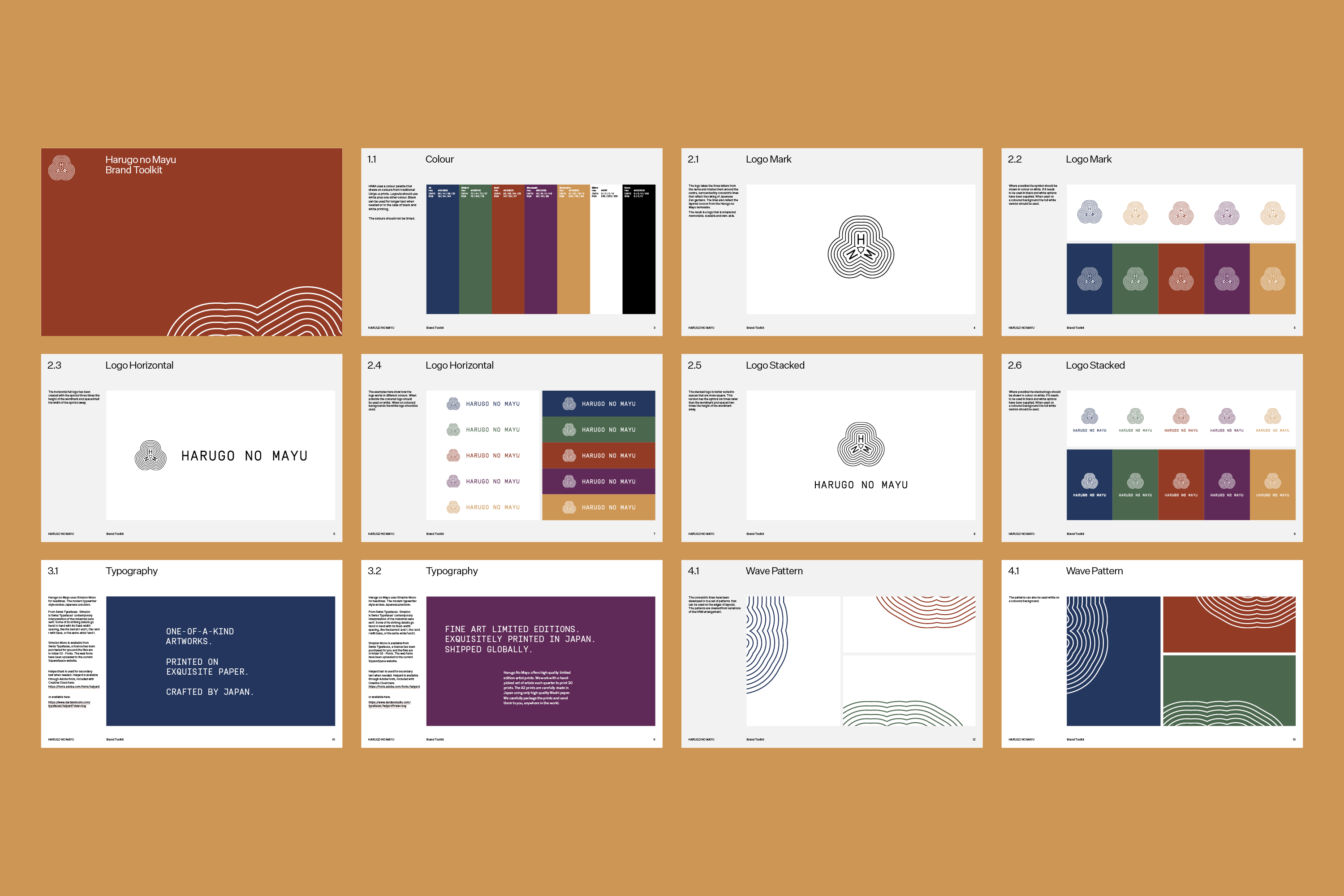
Brand Toolkit
Project Overview
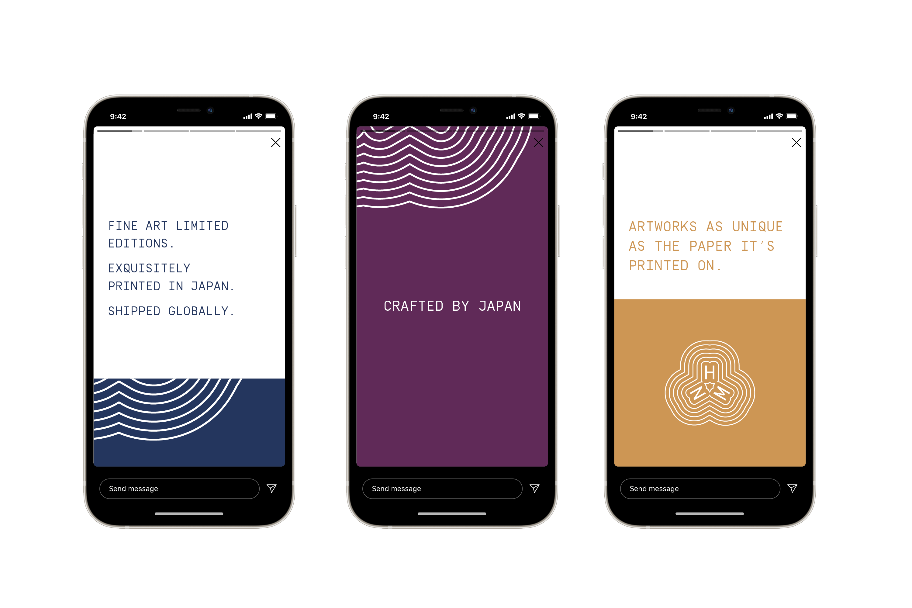
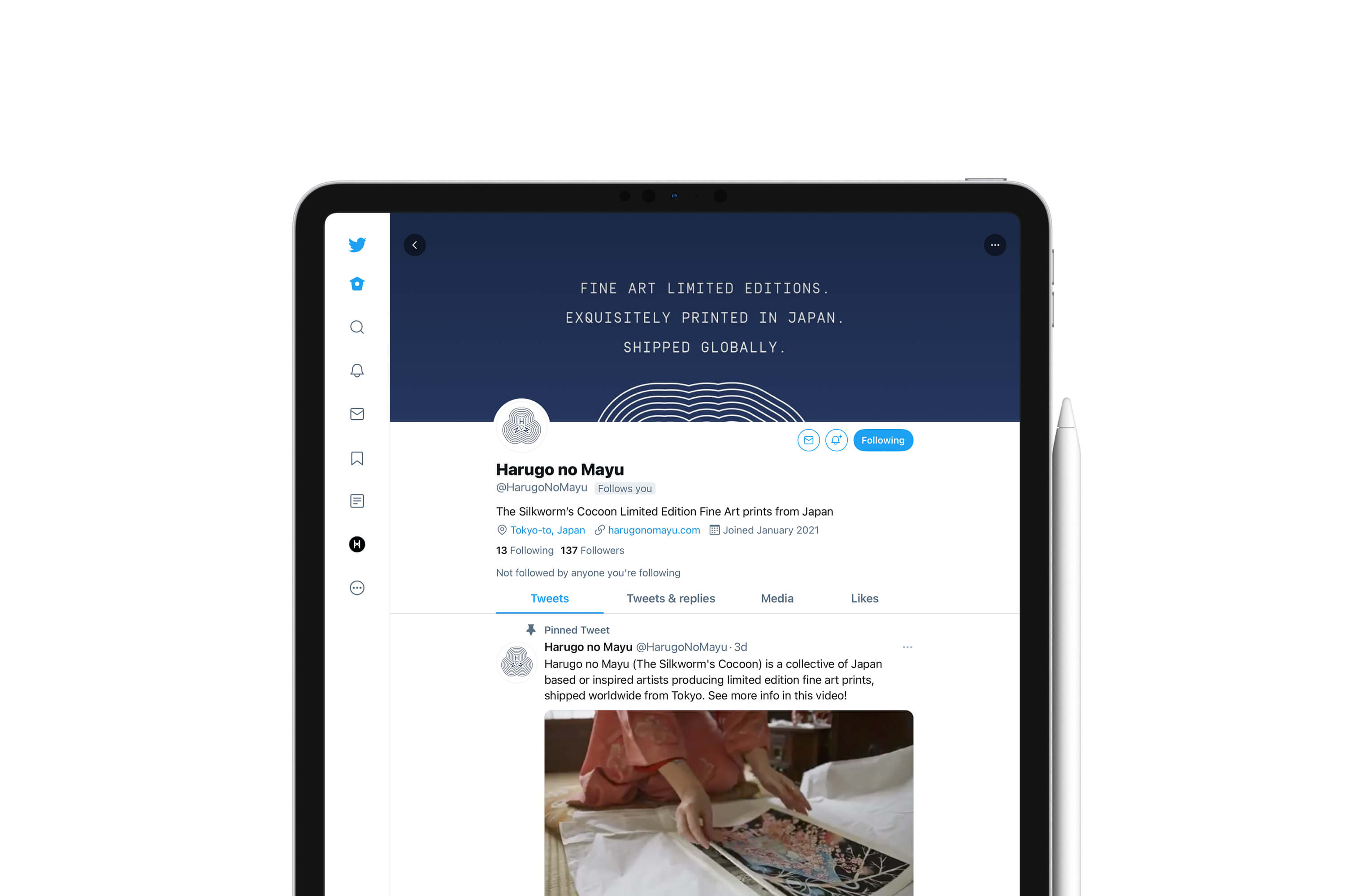
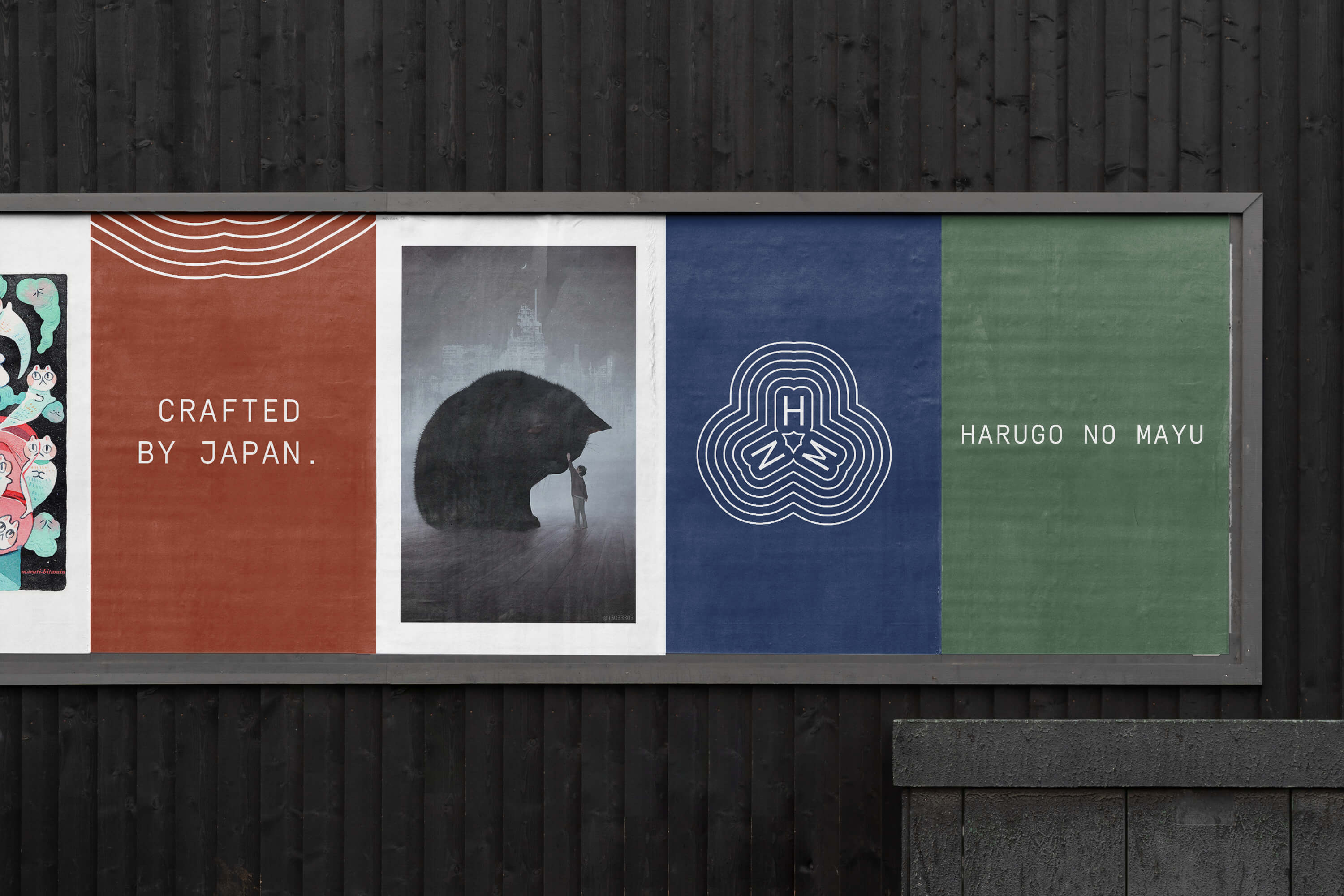
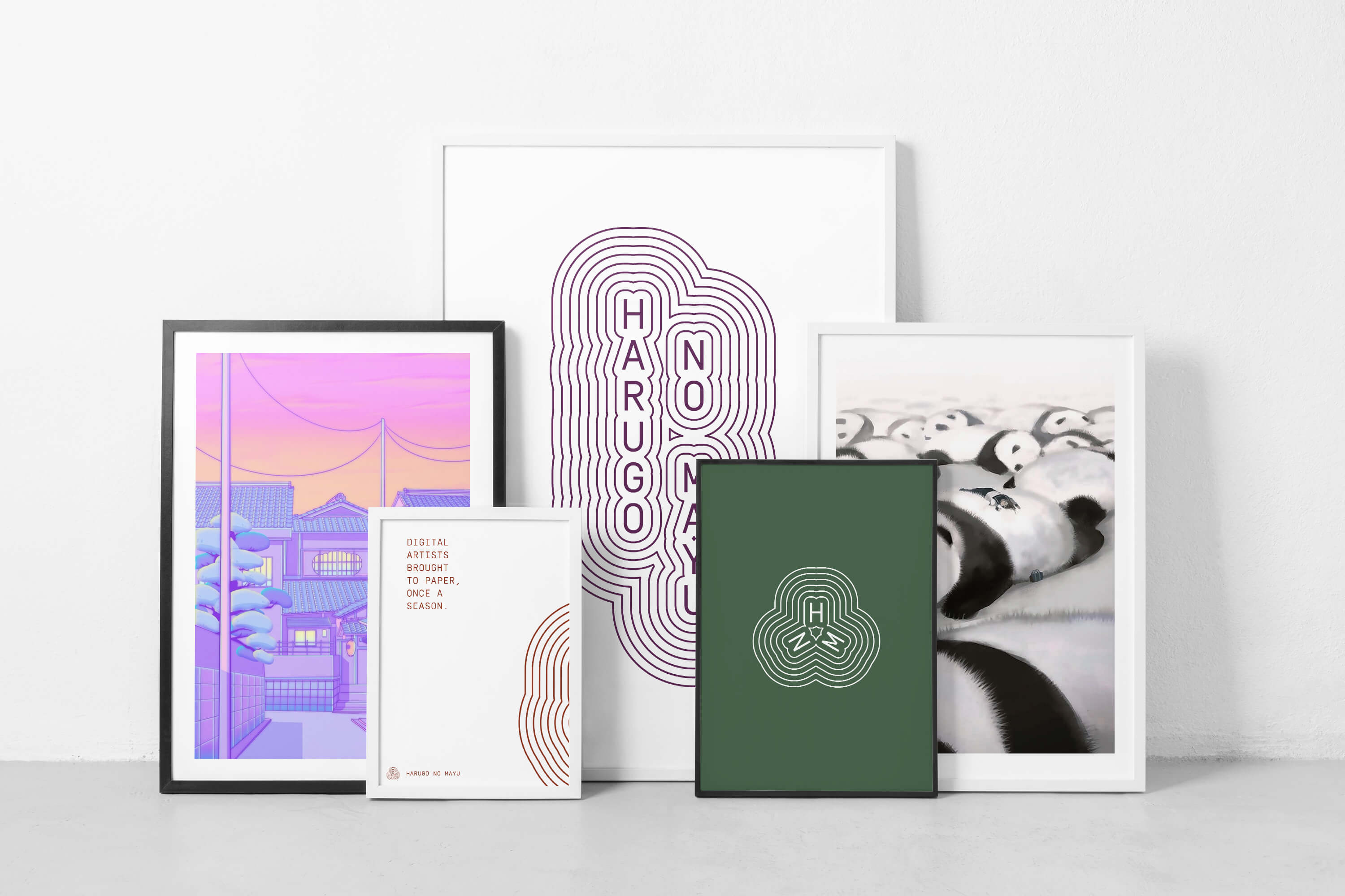
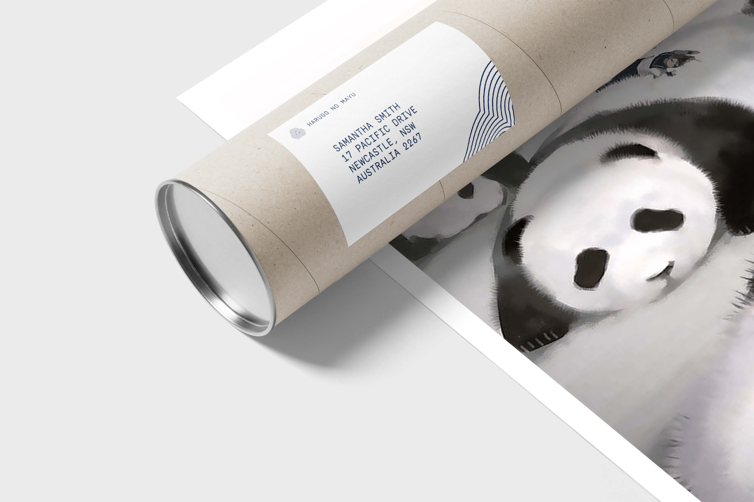
Harugo no Mayu is a new Tokyo based service that works with selected artists to produce high quality limited edition prints. The artworks are unique to the HNM and are printed carefully on beautiful Washi paper and then shipped globally. At the start of each season HNM announces the 5 artworks that will be sold in a one of run of 30, the prints are reasonably priced with a focus on high quality production. All the selected artists are connected to Japan whether they are Japanese, people living in Japan The name Harugo no Mayu translates as the ’Spring Silkworms Cocoon’ the idea behind this was that the project was born at a time artists are in lockdown working in isolation.
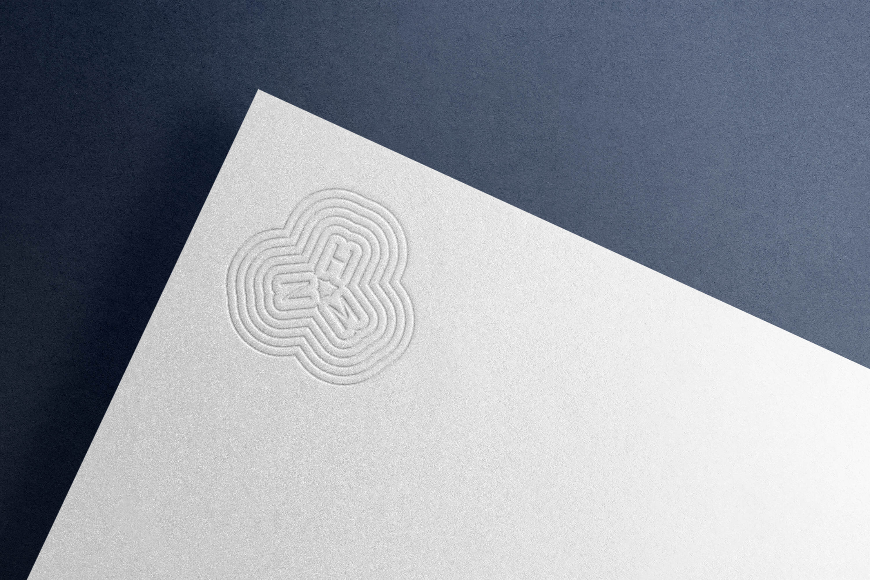
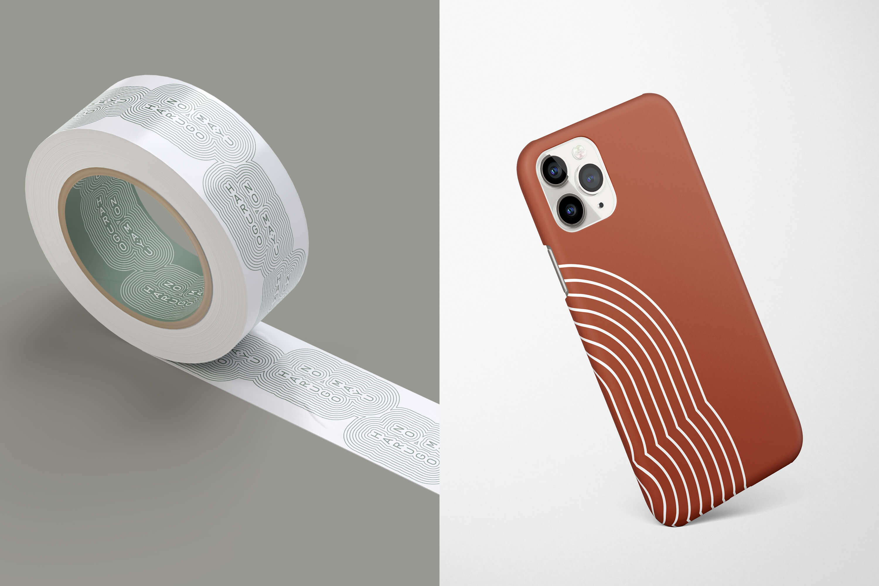
Harley Johnston Design was approached to create a brand identity to help launch HNM. We focused on the Japanese roots, exploring many visual references whilst being careful to avoid clichés and tropes. The logo takes inspiration from both Japanese Kamon (family crests) as well as the zen art of rock gardens where careful raking leaves concentric lines around pretruding feature stones. The colour scheme draws on traditional Ukiyo-e prints with a focus on the white from cocoons.
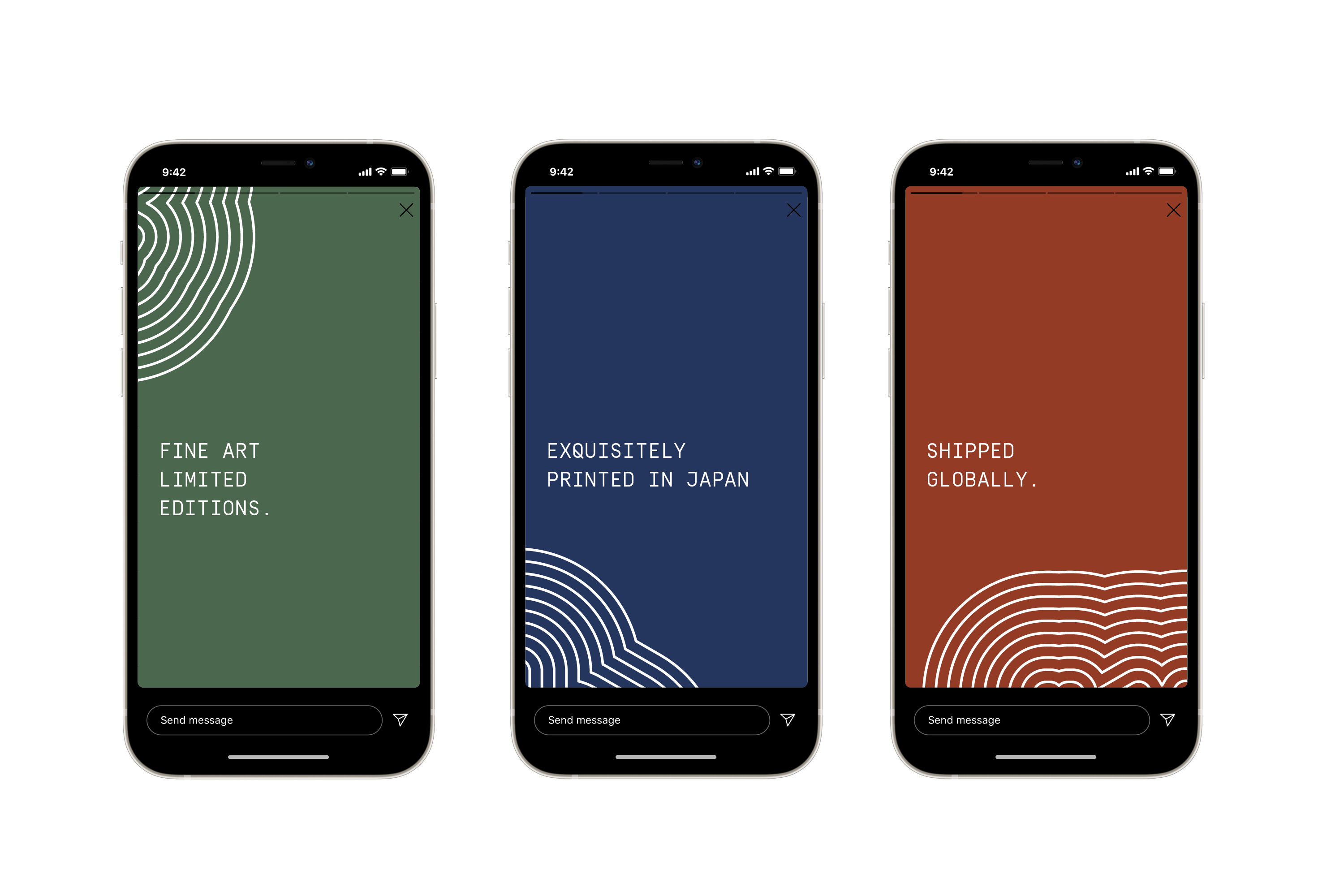
Social media content was created for this brand that lives mainly online.