Presien
Work included
Naming
Brand Identity
Logo Design
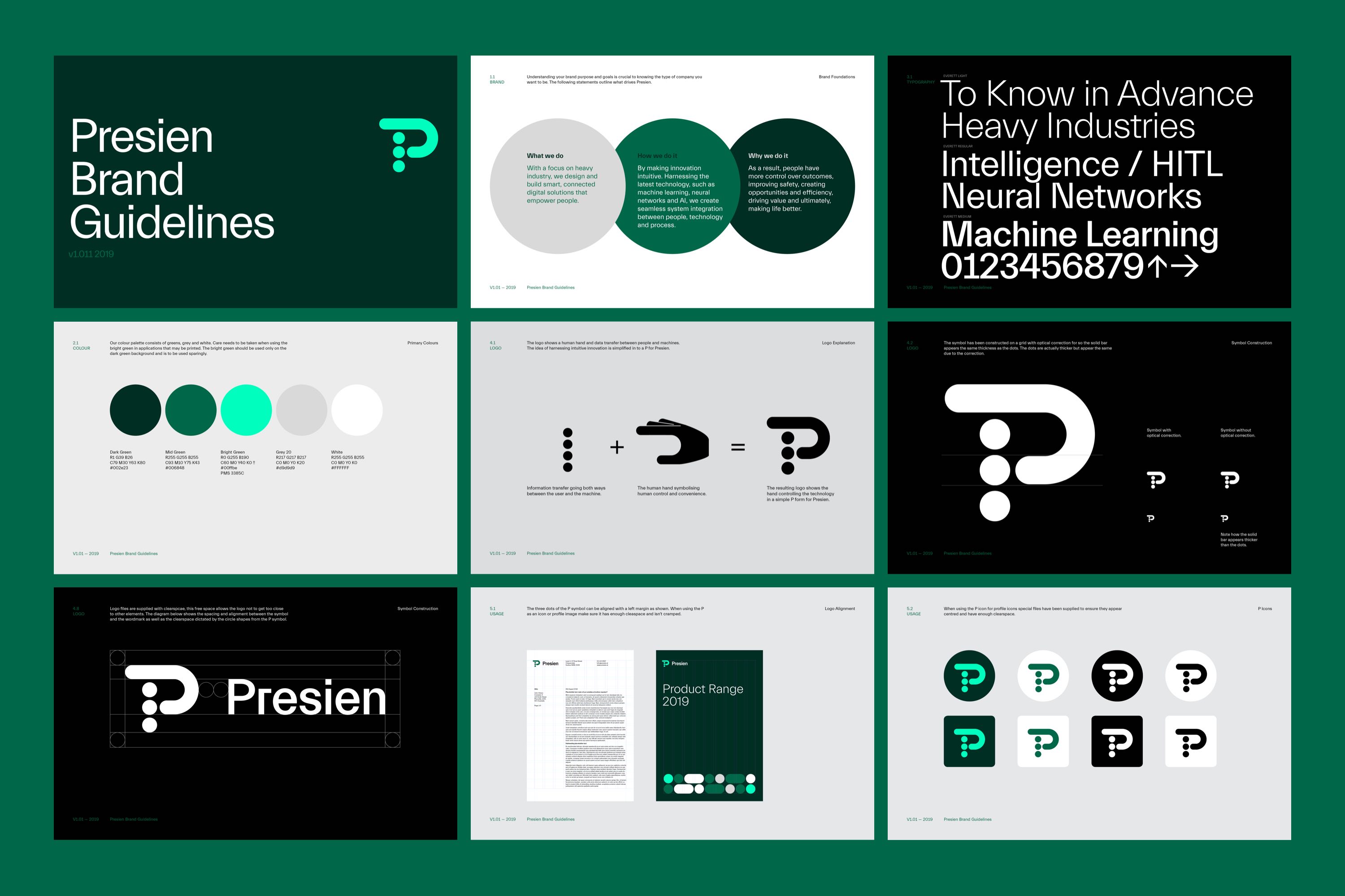
Brand Guidelines
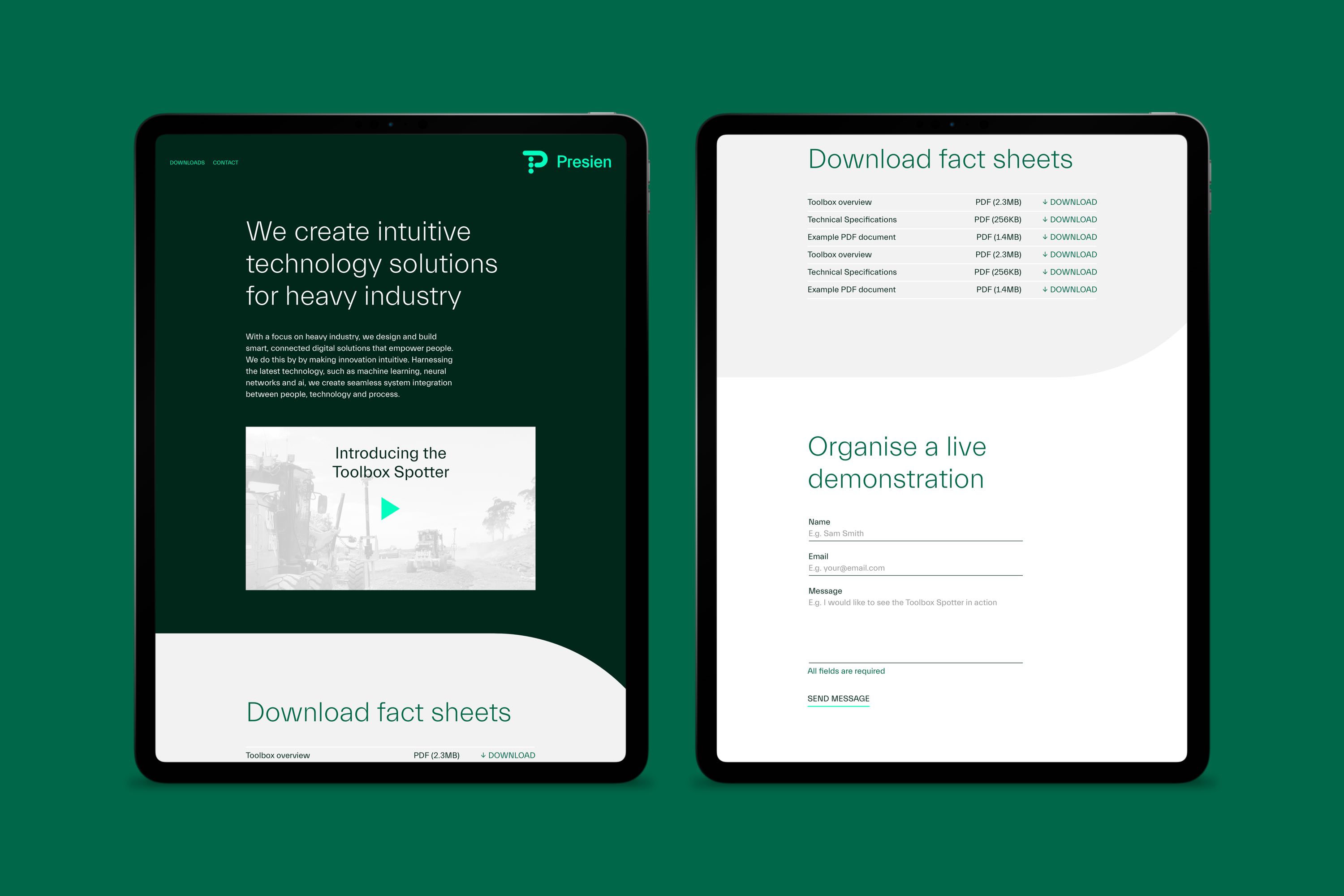
Document Design
Project Overview
Presien is a new company who design and build smart, connected digital solutions that empower people in the heavy industry sector. They started as a division of Laing O’Rouke’s Engineering Excellence division but are in the process of going out on their own. Their first product ToolBox Spotter has been a huge success and they have been struggling to keep up with demand. They engaged Harley Johnston Design originally to create a new logo when they were called PFP Robotics. After assessing the brand and where they were heading we agreed the name was not fit for purpose. What sets Presien apart is their cutting edge software, this was the driving factor when coming up with the name. After working through a long list of name options we landed on Presien, which is a variation of Prescient – to know in advance.
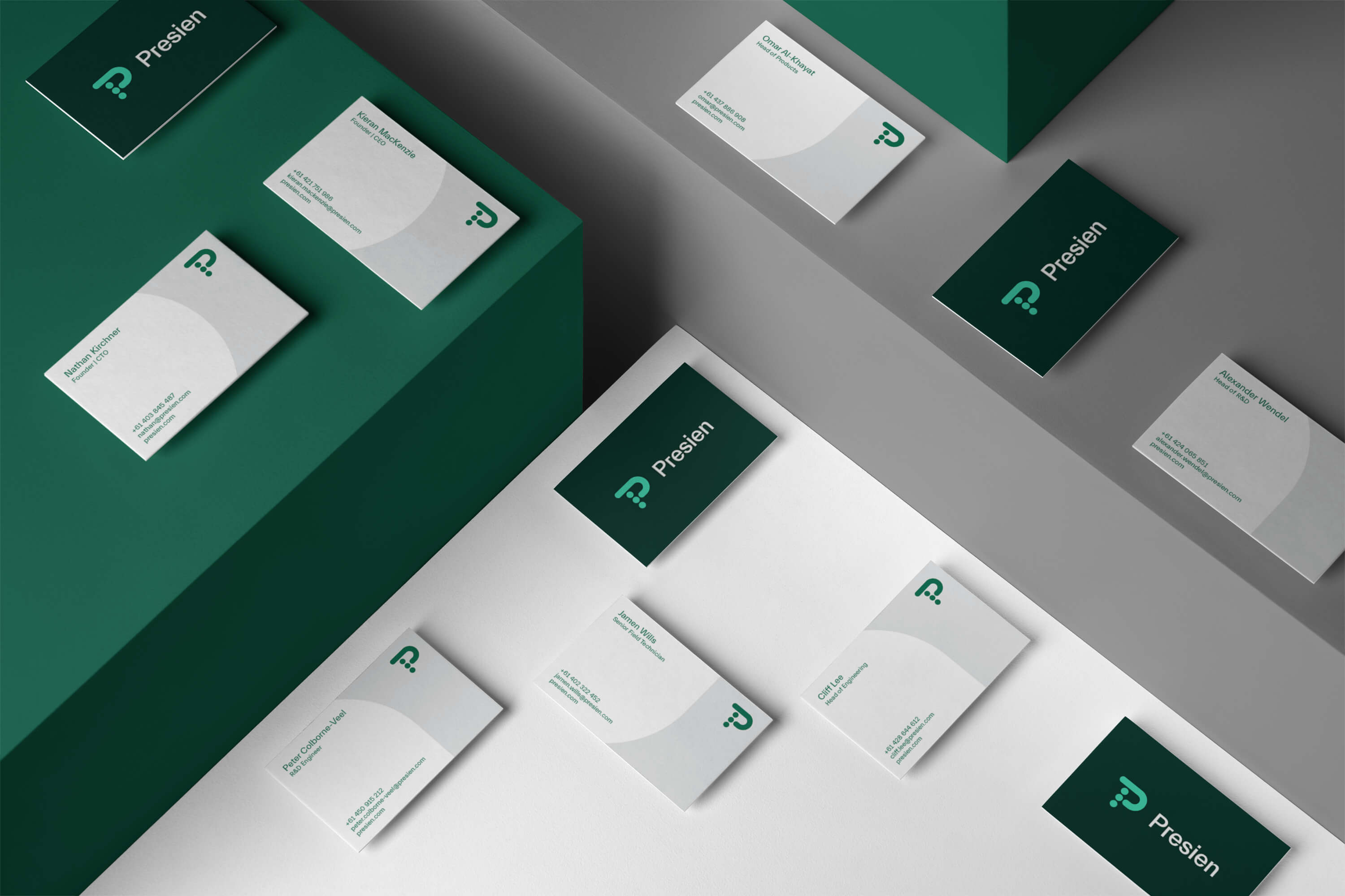
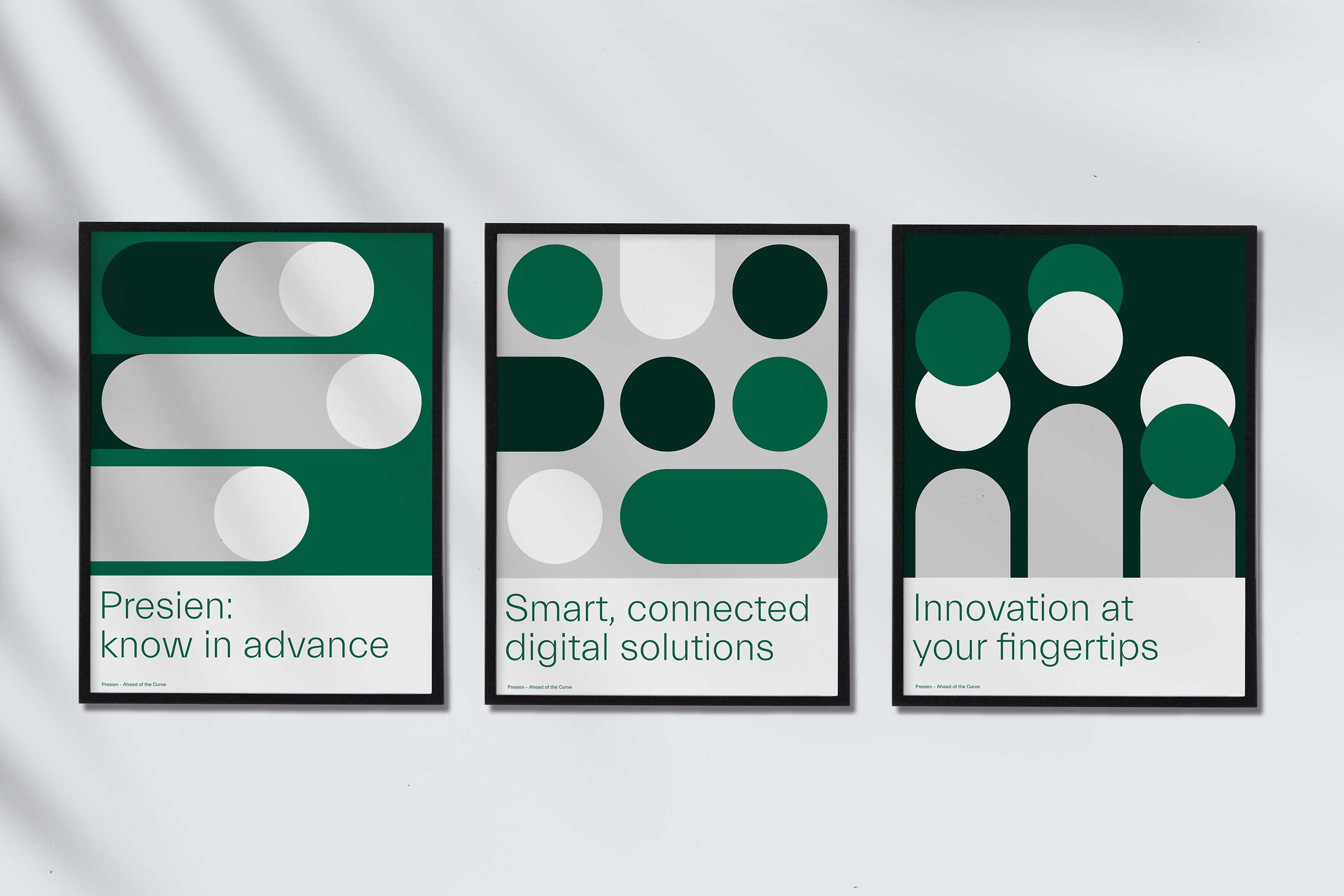
Once the name was in place it was time to develop the brand identity, this stated with the logo. Through discussions we learnt that when talking to people about AI and ML a big concern is human control. Presien make systems that are very simple to use but also give users total control. The idea of human control was visualised by a human hand shape on the right over a set of three dots which symbolise data transfer. A bright green was chosen to reflect the digital ‘on’ signal, showing that the system is working. The aesthetic of dots and ‘pill’ shapes were then applied to stationery and document covers.
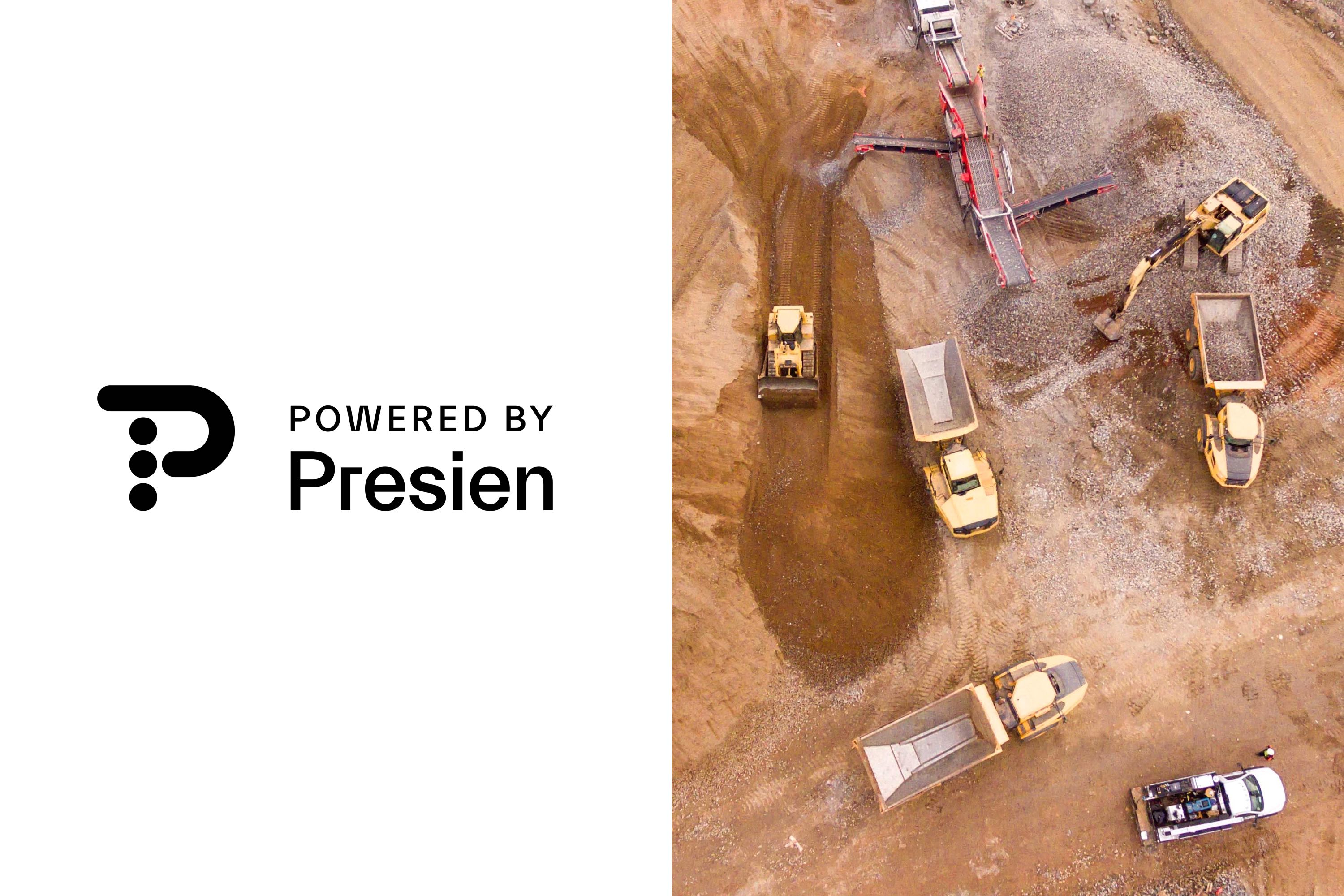
Presien plans to licence their software for use in machinery with existing hardware, for this purpose we created a sub brand ‘Powered by Presien’ to let users know when Presien smarts are used by other brands. This logo will sit alongside the manufactures brand, for this reason the Powered by Presien is always displayed in black and white as to not clash with a range of other logos colours.