Radian
Work included
Naming
Brand Strategy
Brand Identity
Logo Design
Brand Guidelines
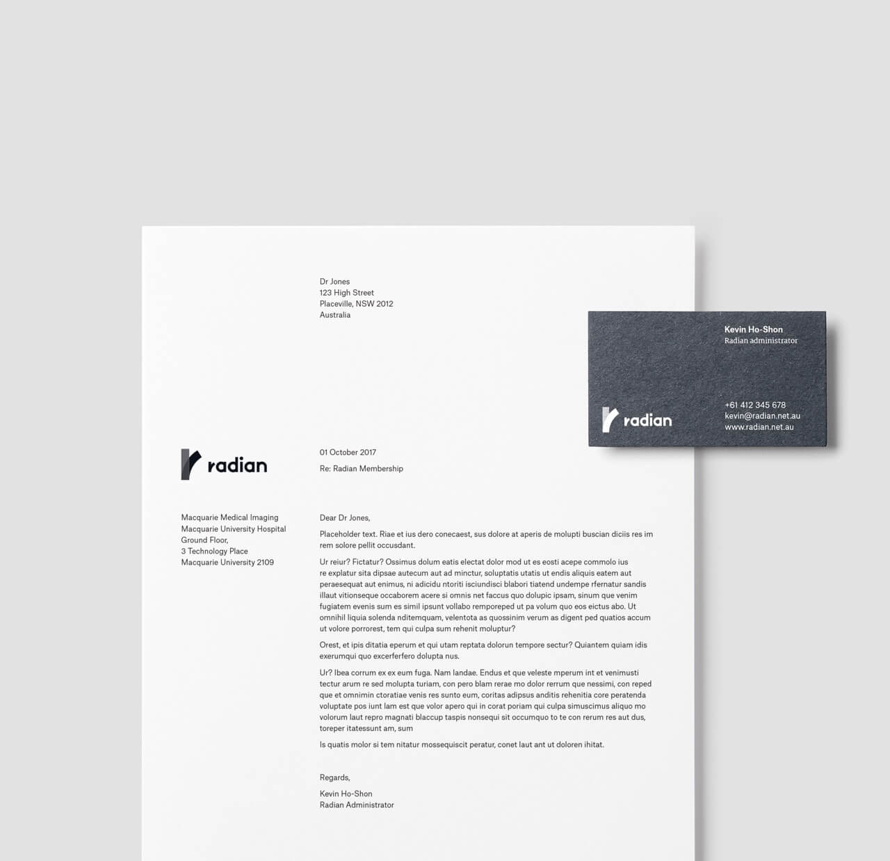
Stationery Design
Project Overview
We were approached to design a brand identity and website for MSPN – Macquarie SMI Professional Network, which comprises of several medical imaging practices sharing staff, knowledge and procedures. Through a serious of meetings we unearthed the fact that the purpose of the new brand was to support the medical imaging staff and foster a strong culture where in other practices there was a habit of owners selling and buying practices without regard for the workers. It also became clear that MSPN sounded generic and cold, most practices use acronyms and we didn’t want to blend in, this lead to a naming process resulting in the name Radian. Radian relates to the scientific nature of the work, a radian is the angle created by wrapping a radius of a circle around the circumference of that circle. It also includes the start of radiology and radiologists.
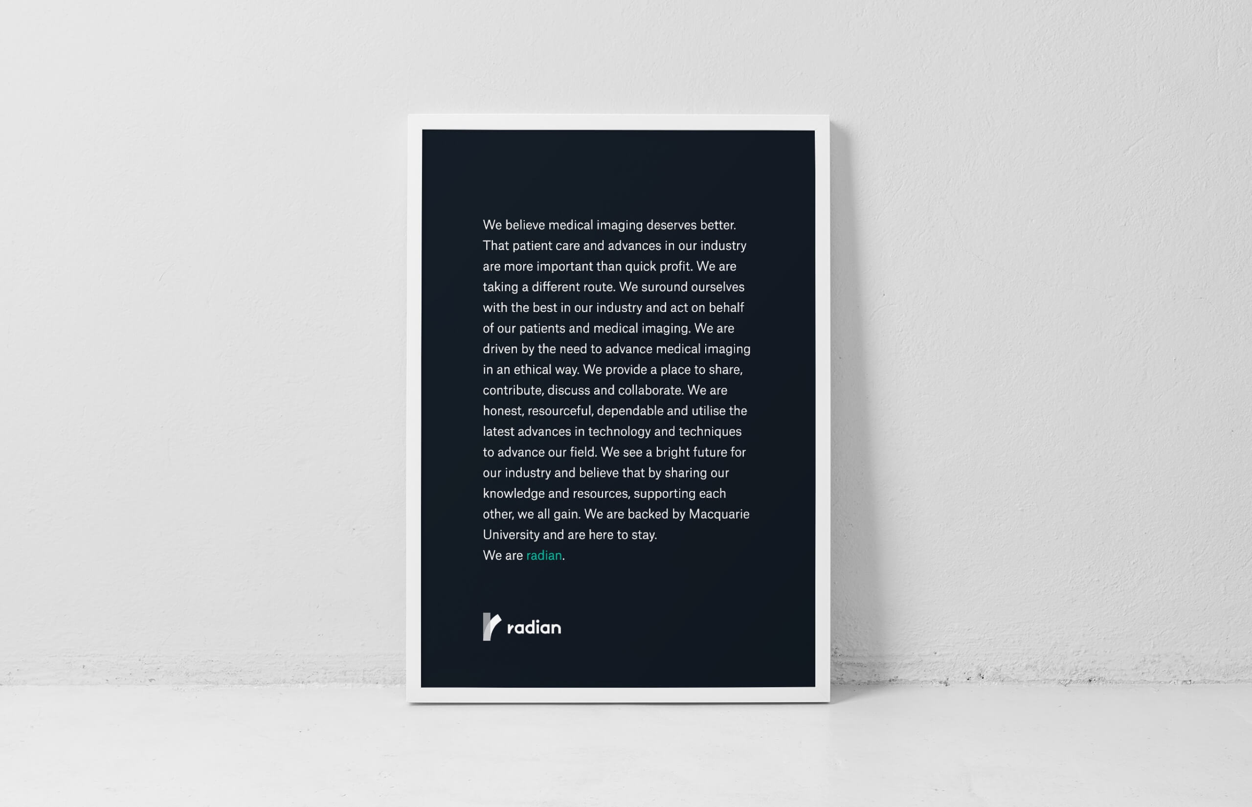
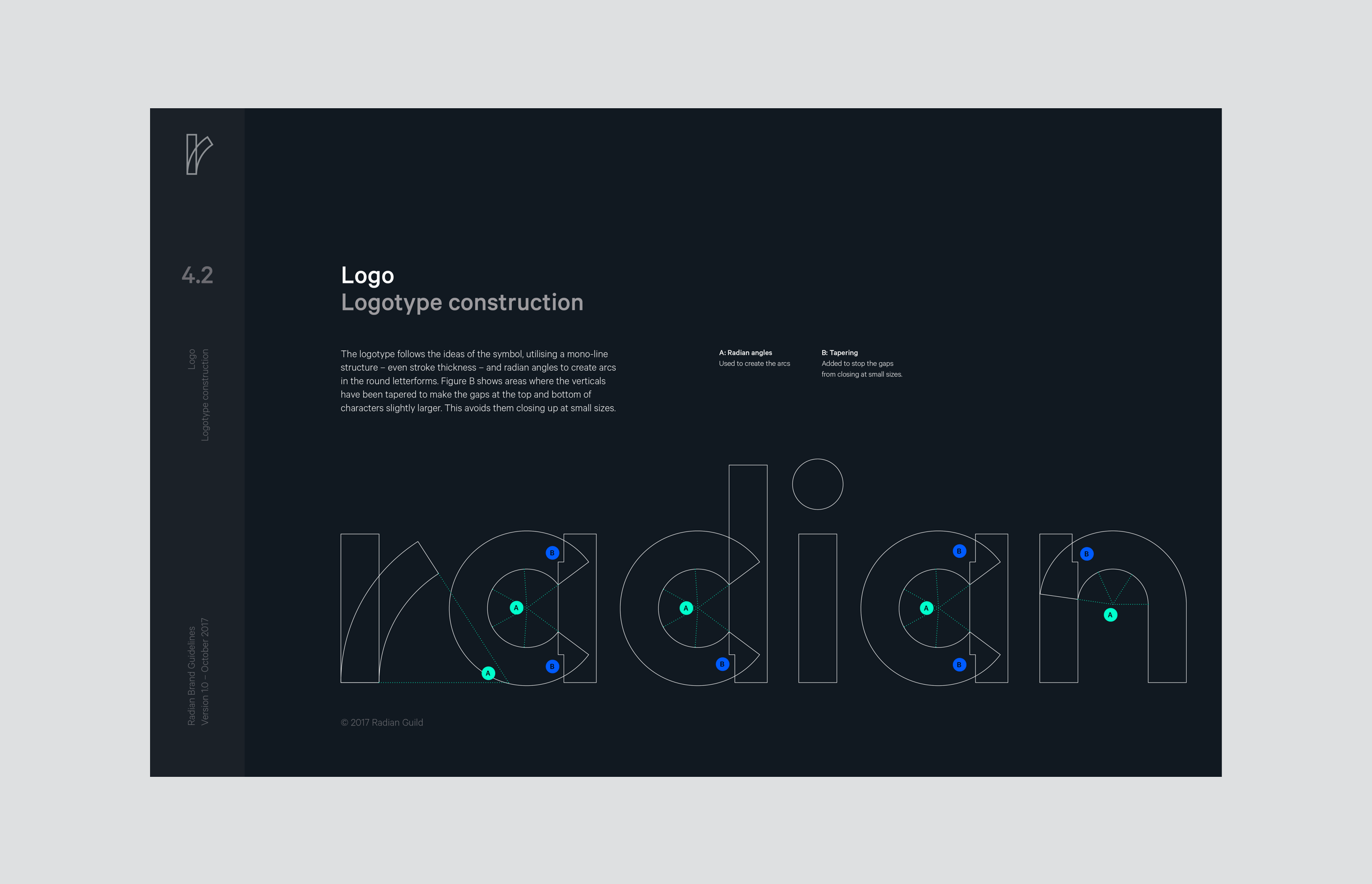
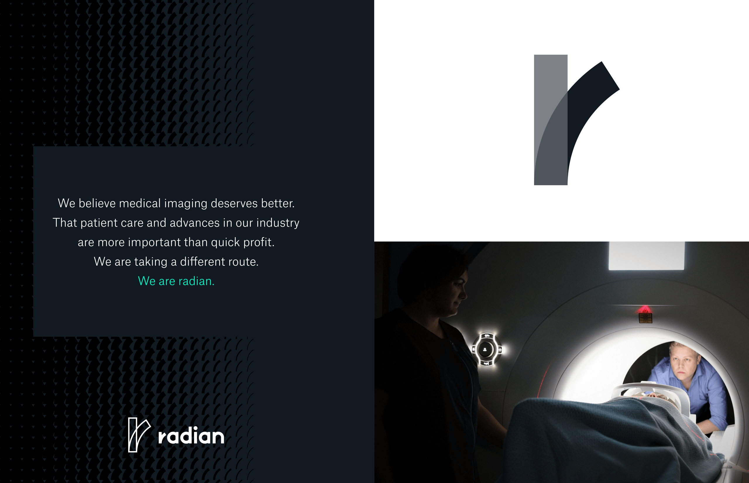
With the new name worked out the logo symbol reflects a literal radian with the curved arc being the same length as the vertical radius, aligned at the base. The symbol also displays an ‘r’ as well as the idea of ‘taking a different route’ which came about when discussing the brand. The logo type is created following the same principals as the symbol, units of radian arcs and straight lines. A brand manifesto was written to help explain the direction Radian was taking. The off black colour takes cues from x-ray film, a highlight green was included to be used sparingly. Custom patterns were developed as well as an illustration style.