Interior Life
Work included
Brand Identity
Logo Design
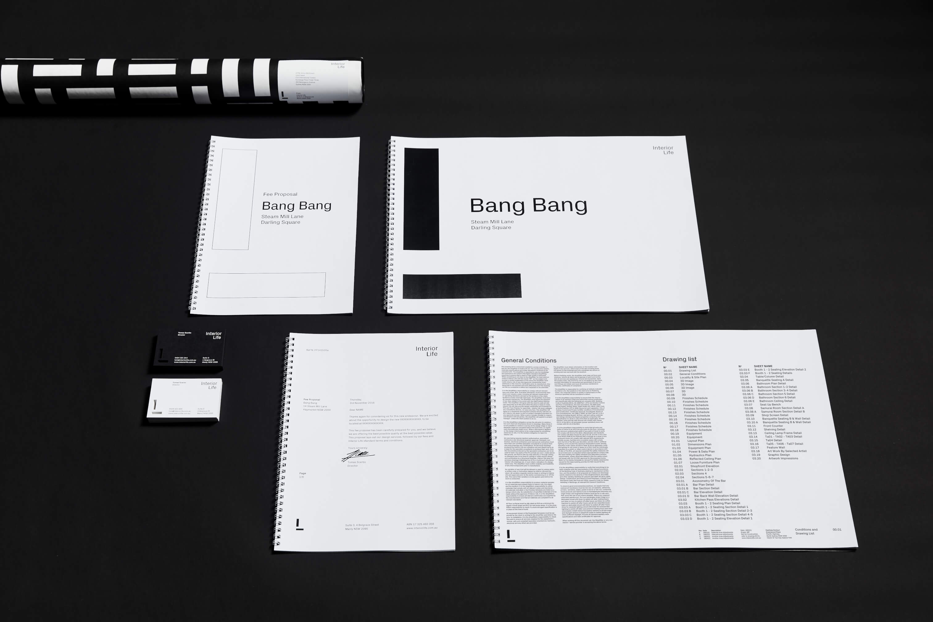
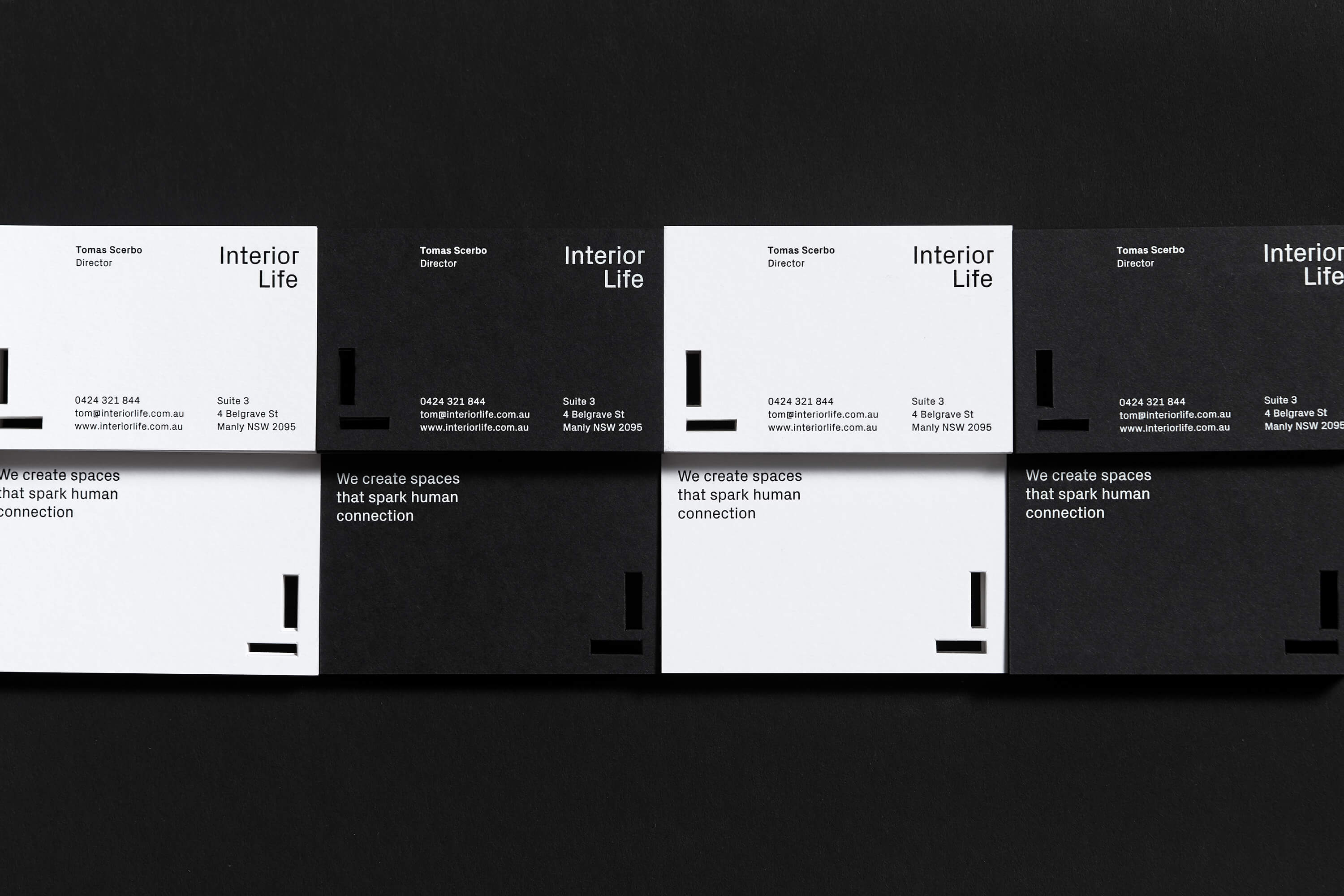
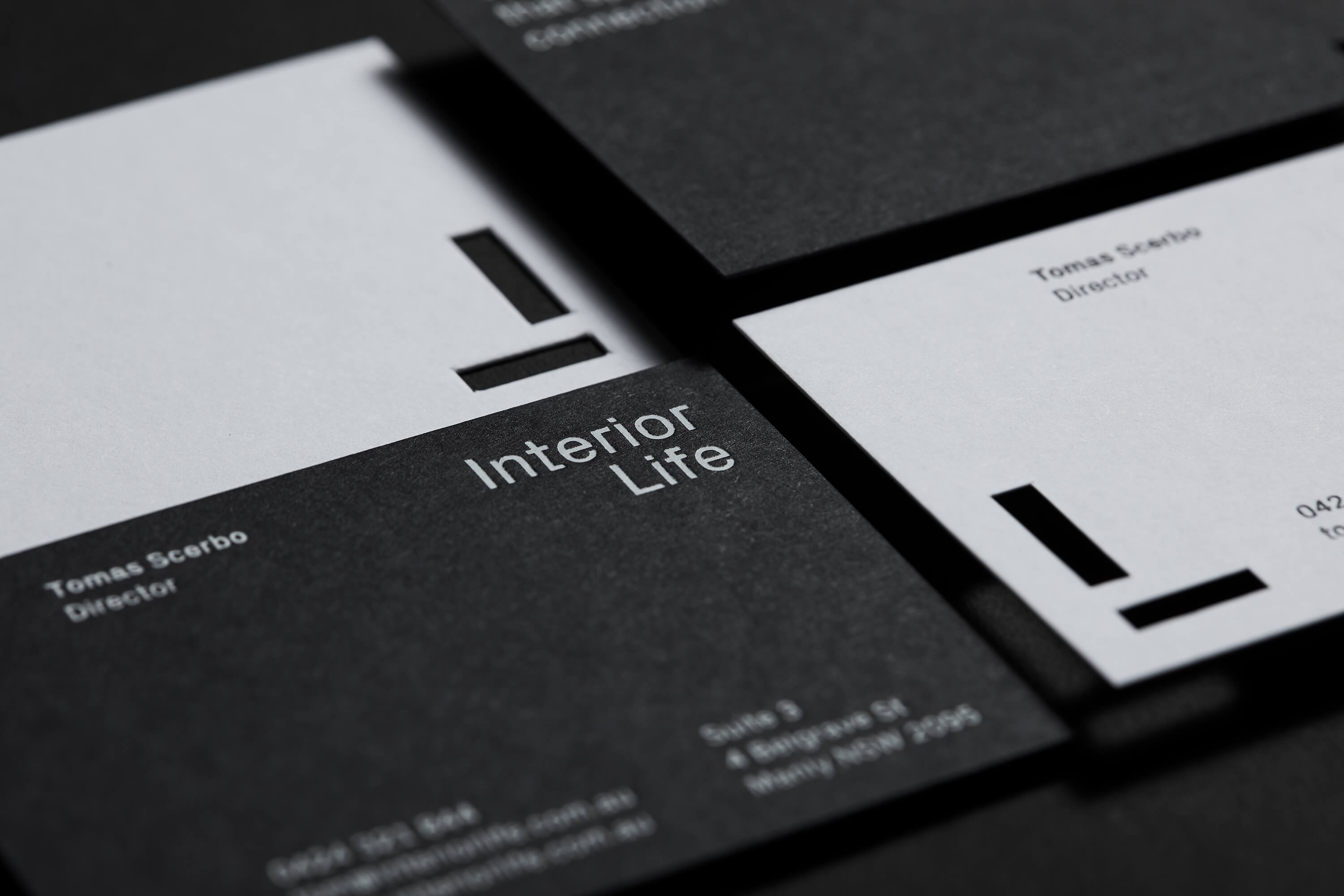
Stationery Design
Document Design
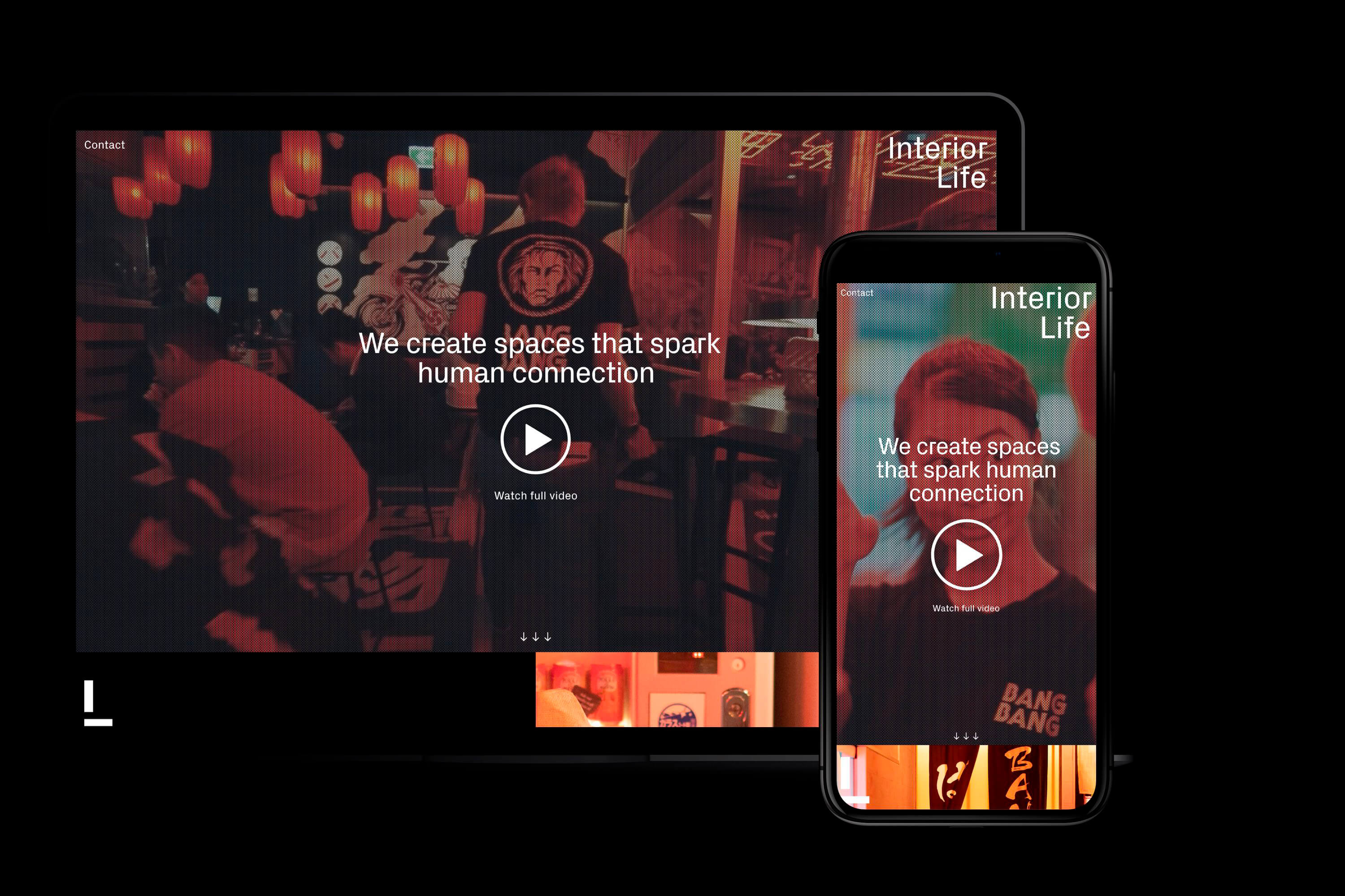
Website Design
Project Overview
After working together on a number of projects – including Bang Bang – Interior Life approached Harley Johnston Design to refresh their brand. We started by interviewing Interior Life’s staff and clients. Beyond offering original authentic design and quality service the theme of creating real human connections came through as the end result of the work that Interior Life delivers. This idea of connection runs through the brand identity in the form of an underlying grid, made of 5mm square units that gives structure to layouts and spacing. The square grid led to the use of the distinctive typeface featuring right angled sections which also relates back to floorplans.
The monogram combines the letters I and L using a simple vertical and horizontal stroke which are also constructed on a square grid. The right aligned text in the word mark helps it to connect to the monogram and allows it to act as a framing device when used at the top right of layouts with the monogram at the bottom left.
The brand identity is displayed in a timeless black and white palette which avoids trends and allows any work presented to be the focus.
The brand identity was then applied to company stationery, client facing documents and website.
Studio Photography: Robin Hearfield