B. Architects
Work included
Naming
Brand Identity
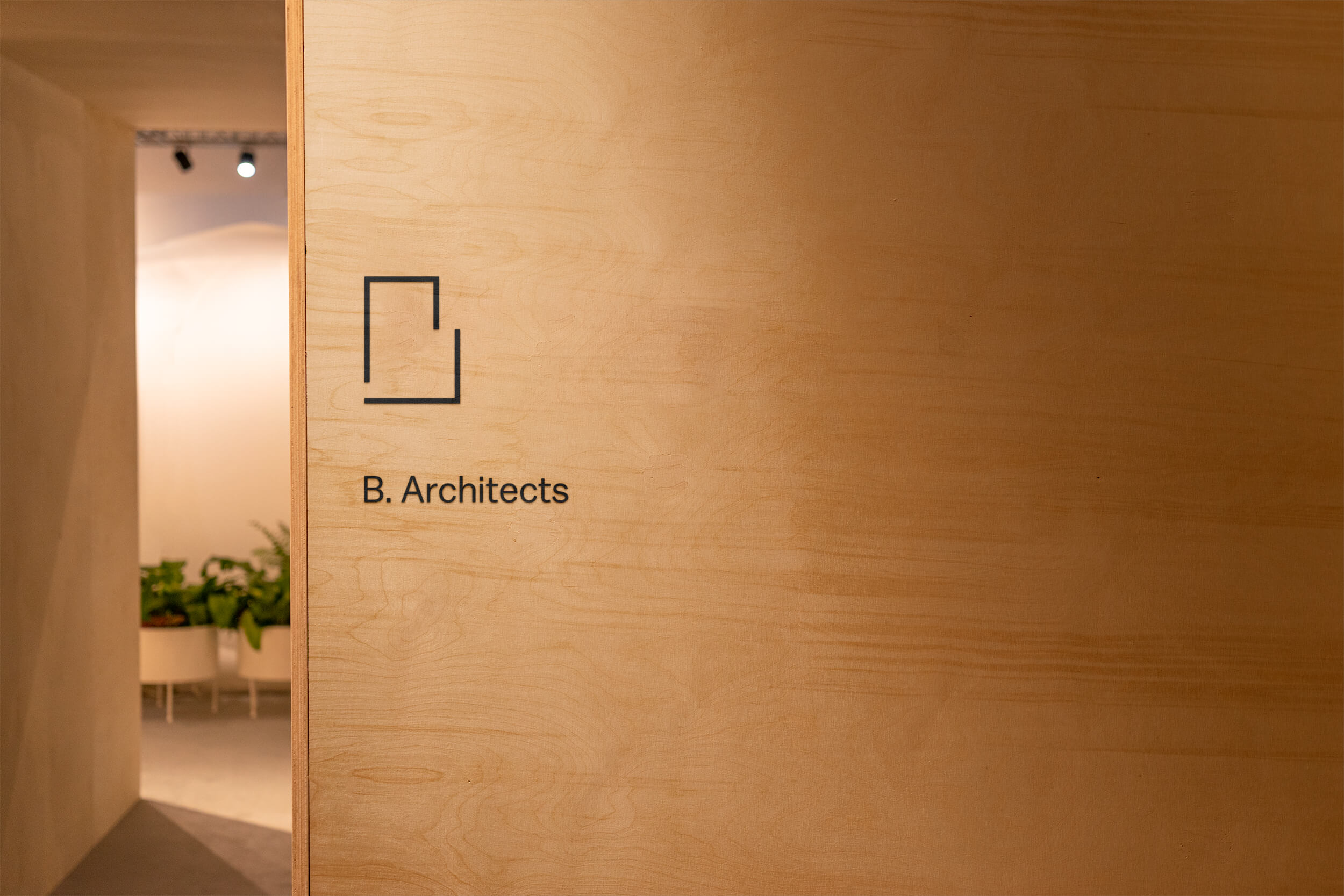
Logo Design
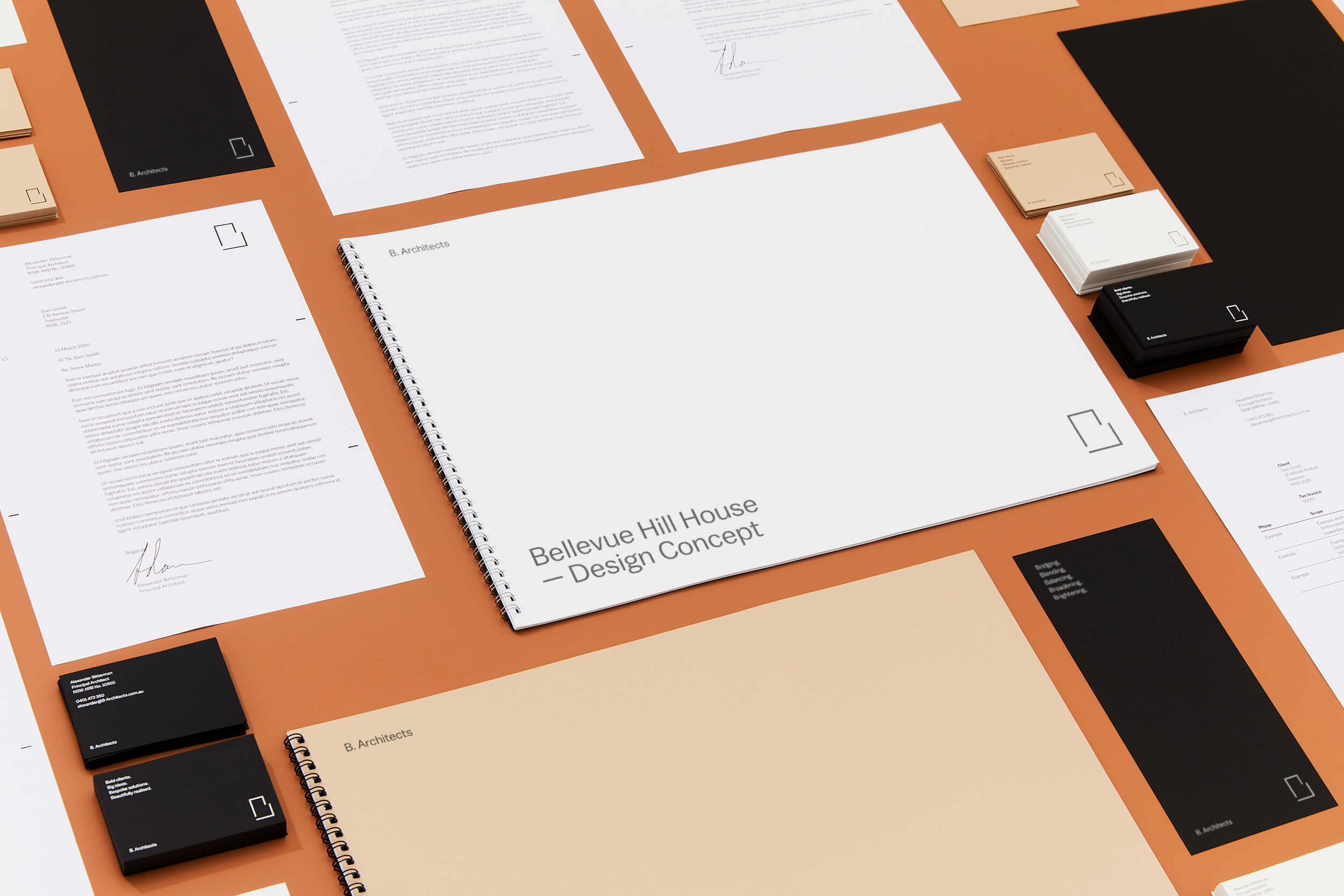
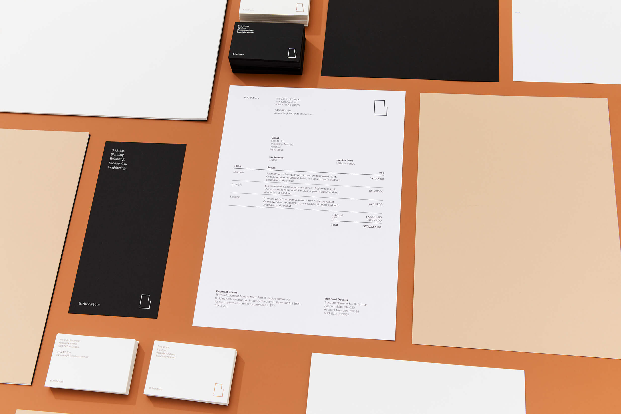
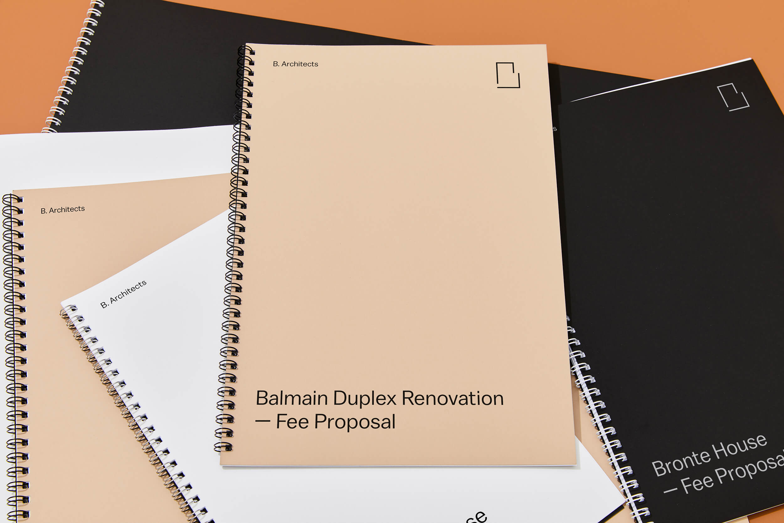
Stationery
Document Design
Project Overview
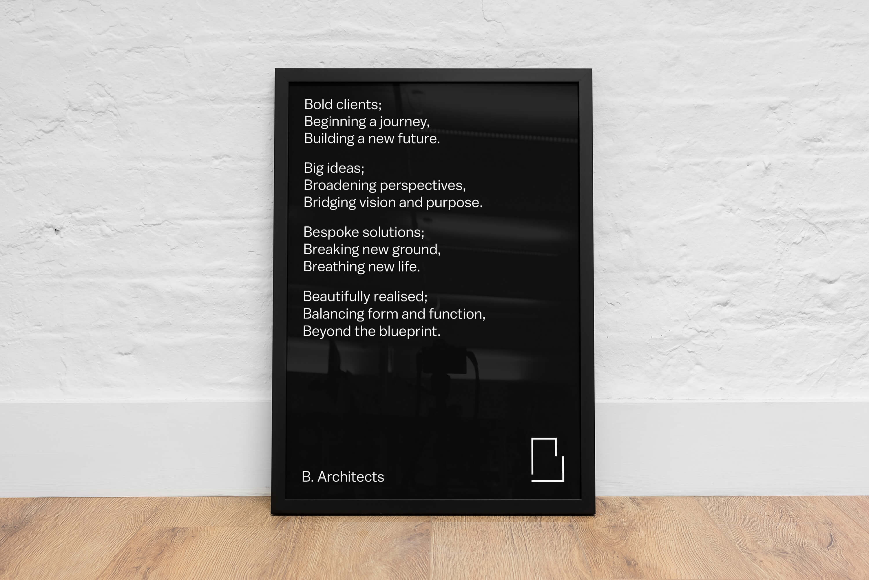
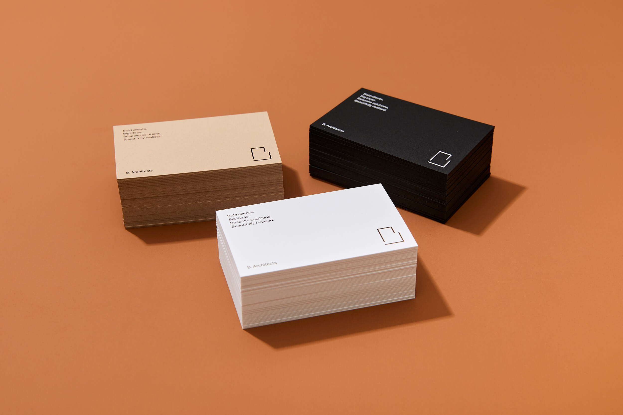
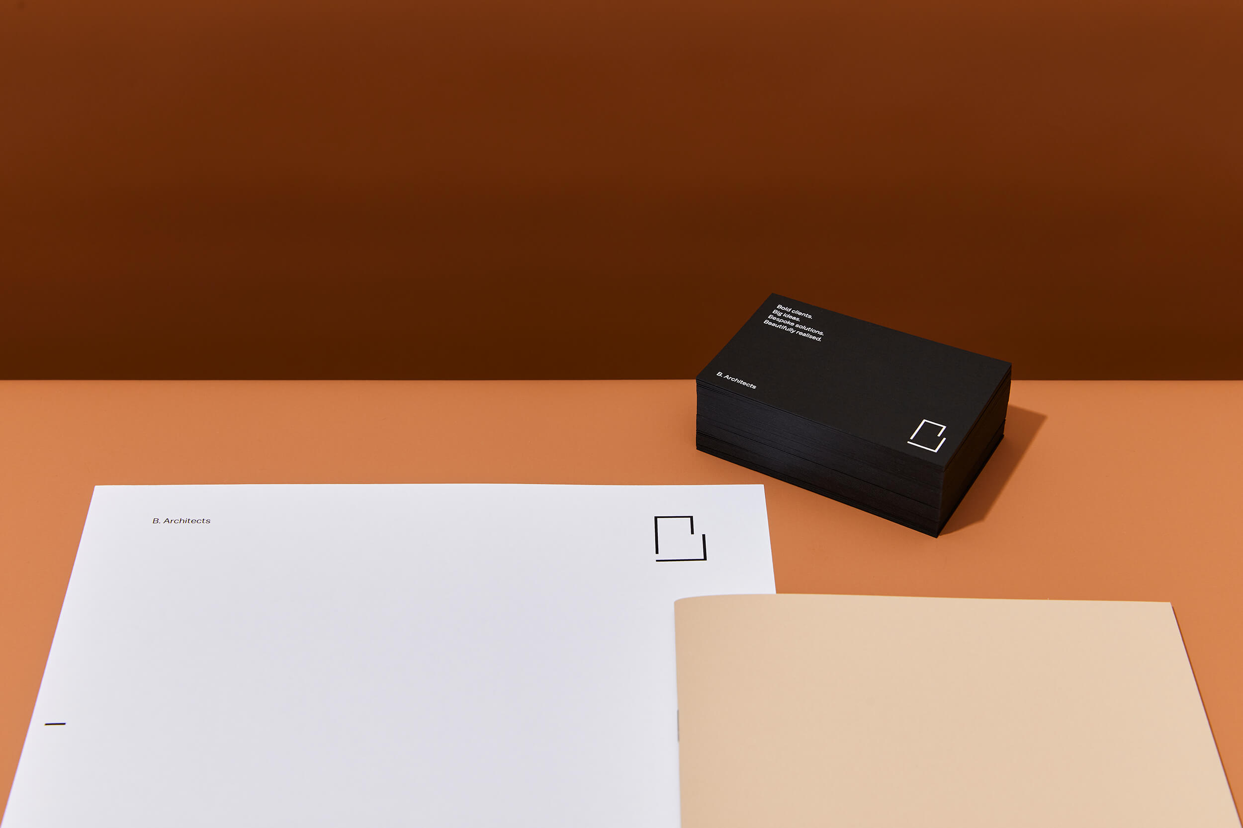
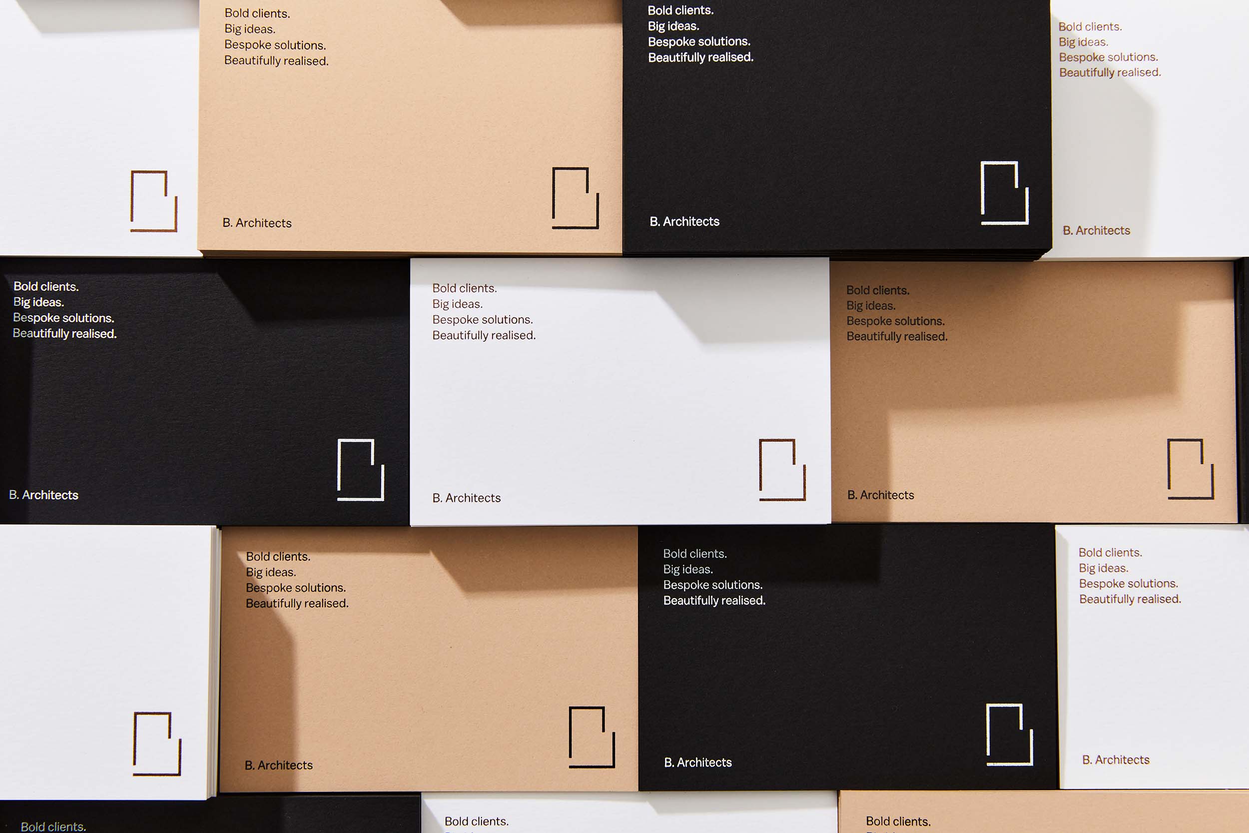
Alexander Bitterman is an experienced architect who works with commercial and residential clients. He was looking to set up his own practice and approached me to help with naming and brand identity. We discussed name options and opted against the traditional practice of using ones surname or an acronym and instead we chose the first letter of his surname, B. Architects. This then gave me the idea ‘what if we based the whole identity around the letter B?’ This lead to the colours Black, Beige, Blank and Bronze, using the Balto book and bold fonts and also the brand outline ‘Bold clients, Big ideas, Bespoke solutions, Beautifully executed’. The B logo was informed by Alexander’s open approach and styled around the forms of floor plans. This was paired with the name set in the brand font at the same scale as the text on the page.
Business cards were created using a paper stock with a surprising rough texture made from potato starch, three versions were created using the brand colours. Document layouts are built on foundational grids applying a considered approach reflective of the architects work.
Photography by Robin Hearfield